Imagine ordering a meal from your favorite restaurant. You salivate with anticipation as the waiter approaches with dinner — but something is off. The Caesar salad is served in a champagne glass. The steak is flopping around a bowl. Instead of a fork and knife, you are given a toothpick. The content of the meal is perfect, but the containers and tools make it insufferable. This is why user interface is important. Without a good user interface, users are not able to access and enjoy the content of a project, whether it’s research or a tool.
Just like putting steak on a plate, getting user experience right is pretty simple. There’s no big secret to making good interfaces. All it takes is a pencil, paper, and one question, can the user easily accomplish what they are trying to do?
Grab a paper and pencil (or open PowerPoint, if preferred). In the bottom right corner of the page, write what the interface should be able to do. Keep it big picture. As an example, imagine building a texting app. It needs to send, receive, and display texts. Texting apps are more complicated than this, but the point is to have a goal to work toward. If the texting app cannot send texts, it’s pretty much useless. Ask the question, what would this project be absolutely useless without?
With a goal in mind, the next question is: How does the user get there? To show where the user is going, draw a box around the goal. For the texting app, the box would say “send text”. A destination is great, but a user cannot navigate with it alone. Like a GPS, knowing how to get the user to the goal requires knowing where the user is starting. In the top left corner, write “entry” and circle it. This will be the user’s starting point.
There is an important difference between the starting point and the goal. The user has to perform an action to start their journey; they have to open the software. The goal though, is not an action. It is a result. To keep things organized, circle actions, like searching, or picking an option. Boxes go around things the user looks at, such as a welcome screen, drop down menu, or the results of a search. These are called screens, because they display information. Using different shapes for actions and screens will keep things organized.
With a beginning and end, a path connecting them must be created. This path will be made of three shapes:
- Circles / Actions: Represent when a user does something (picks an option, enters a search).
- Squares / Screens: Represent when a user sees something (a welcome screen, a result).
- Diamonds / Questions: Represent when the flow splits. Always phrased as a question (is search valid?).
Diamonds are where the map will split into a different path, depending on how the question is answered. In the texting app, the map would start at “entry”, then a “contacts” screen would be added, with an arrow between showing the user’s direction. “Select a contact” would then follow, in a circle.
The user has chosen a contact, but the app must verify if the contact is valid. A diamond is used to indicate the question, “Is contact valid”? If the contact cannot receive texts, the user should be sent back to select a new one. If the contact is valid, the user is allowed to move forward. These branching paths are drawn on the map, leading to screens displaying the result.
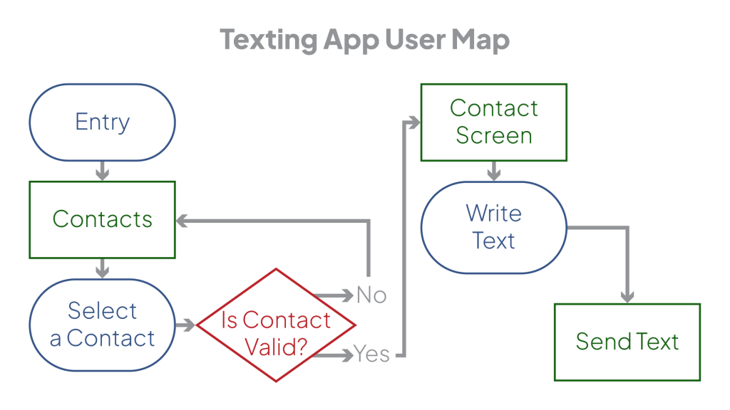
Using this as an example, place diamonds on the map when the path must split. Make sure each split has an accompanying question that clarifies what information is used to decide the path take. With these diamonds, all the components needed to sketch how a user interacts with the project are present. Showing the user new information, having them make a choice, then using that choice to inform a decision, is the basis of user interface.
Repeating this process, all the information the user needs to see on the way to their desired result will be written down. The map should be connected from beginning to the end. This map, or flow, provides a clear path with defined things the user must do. The only task left is to collect those interactions, and decide where the buttons go on screen. A simple process for sketching screens is available in the next article.